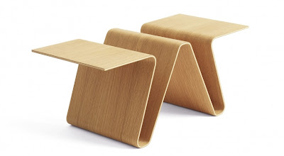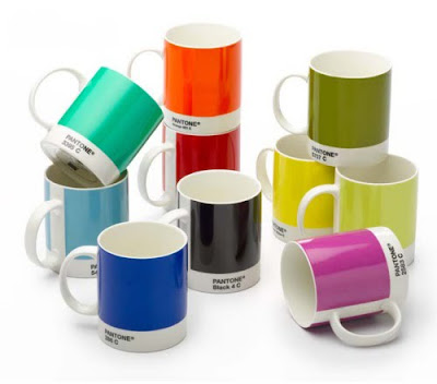
So, it's actually called the tablemaster table, but I renamed it, because W table makes more sense to me. It is designed by Norwegian power duo Anderssen & Voll, which used to be one half of the dismanttled Norway Says (I'm waving a minimalistic flag in their memory). I love it for it simplicity, and stunning lines, but mostly because it makes sense: areas for magazines, and horizontal surfaces to put your most precious shit on. And by precious shit I mean your cup of coffee. And considering the table, your coffee mugs probably look something like this (I own the Process Yellow C cup):

But don't be uncouth: use a coaster.

love the table!! I need somewhere to put my magz...but eh...on the mugs
ReplyDeleteThat's great. The cups are really more for people that work with graphic design. Pantone is a company that comes up with the best color combinations, and what is cool about the cup is that you have the color name on the cup, so if you wanted to match that to say a photobook that you are working with, you have the name already, but really it is more graphic design geek than anything else.
ReplyDelete